As a visual representation of a network (graph), the node-link diagram is widely used to represent nodes as dots and edges as links connecting dots. However, node-link diagrams often cause visual congestion, making it difficult to grasp the structure of the network. Partial edge drawing," which omits (does not draw) some parts of links, has been proposed as a way to resolve visual congestion. While not drawing link intersections improves the readability of the network, it places the burden on the reader to guess the omitted part. We are developing "Morphing Edge Drawing" to solve such problems. By changing links between fully drawn and partially omitted states, we aim to improve the readability of the network.
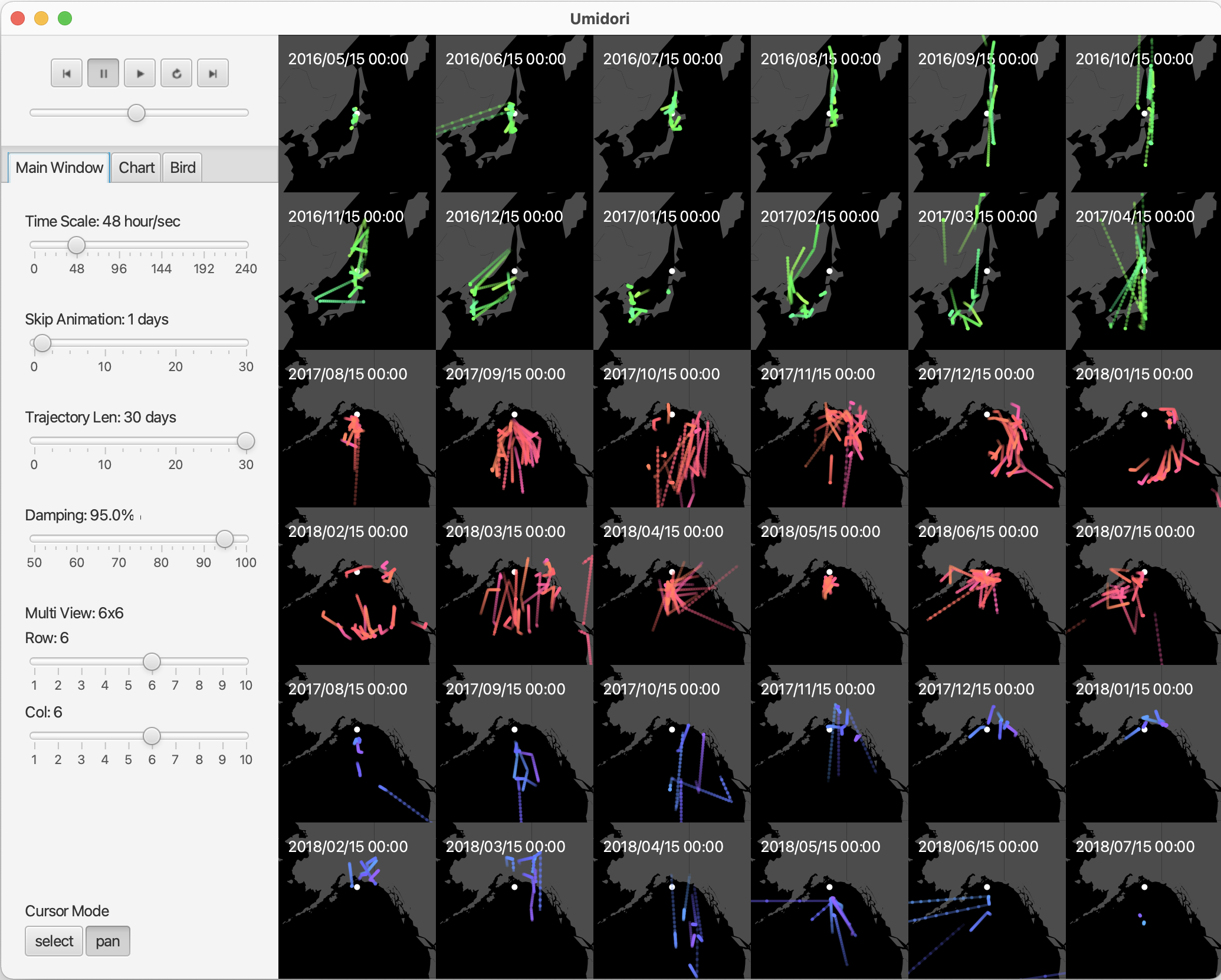
Because seabirds have different migration patterns depending on their group, habitat, and season of activity, it is necessary to compare movement data under various conditions. Movement data is positional data with time, and in many cases it is analyzed by visualizing it on a map, but it is a complicated task for bird researchers to create a visual representation of movement data suitable for comparison. We have developed a tool to assist bird researchers in this task. The tool uses animation to represent bird movement and displays multiple animated views using a technique called Small Multiples. The user is free to create Small Multiples that combine multiple criteria such as group, region, and time period.
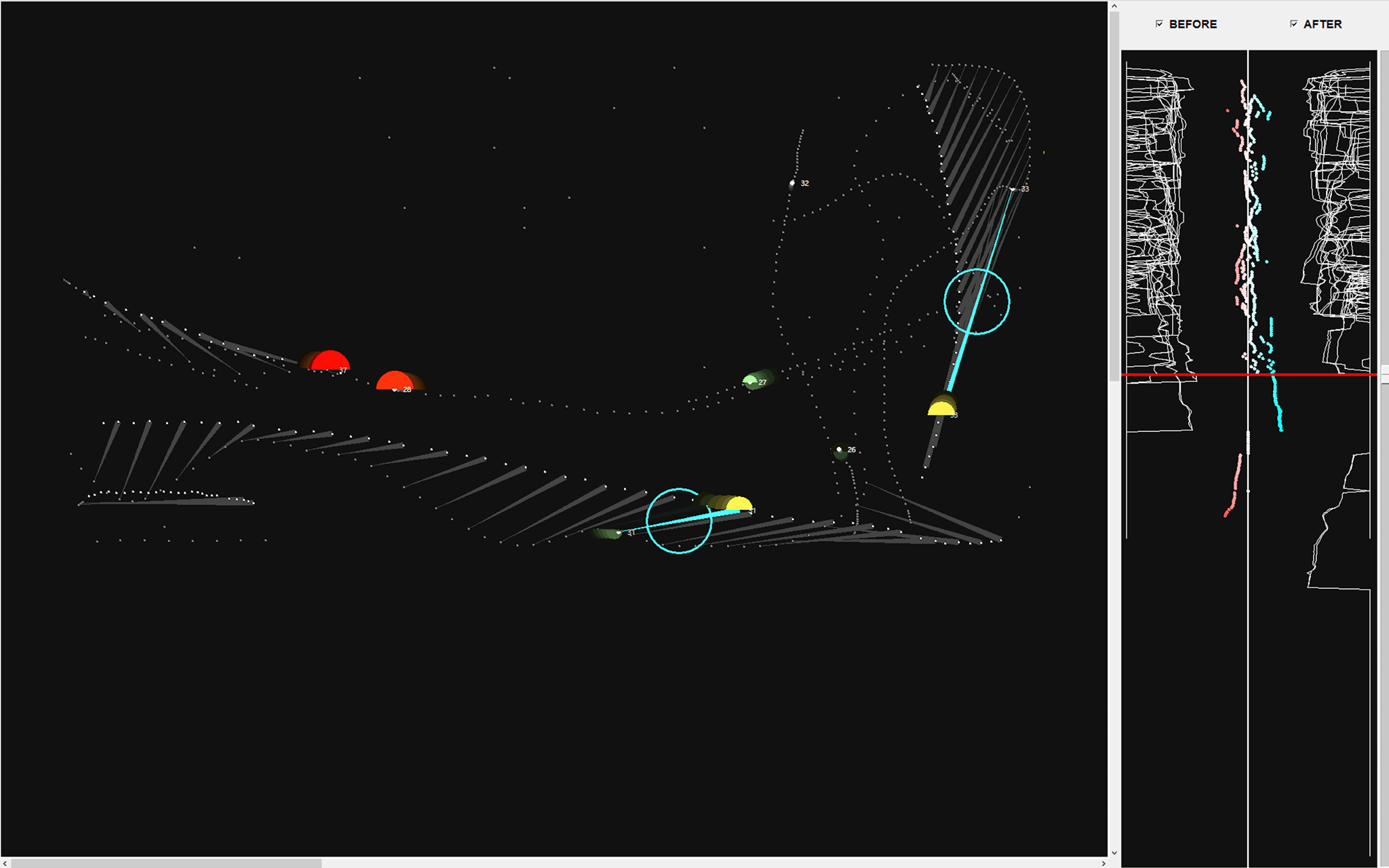
Coordinating the movements of vessels may reduce the risk of their collision. When computer simulation finds such coordination, analysts, including designers of the simulation, desire to understand the effects of such coordination. The risks can be treated as a type of spatio-temporal data. The authors have tried to visualize the difference between pre-coordination data and post-coordination data to represent such coordination considering factors such as target, time, area, direction, distance, purpose, and effect. Developed visualization techniques enable analysts to intuitively understand vessels' movements and collision risks at each time point.
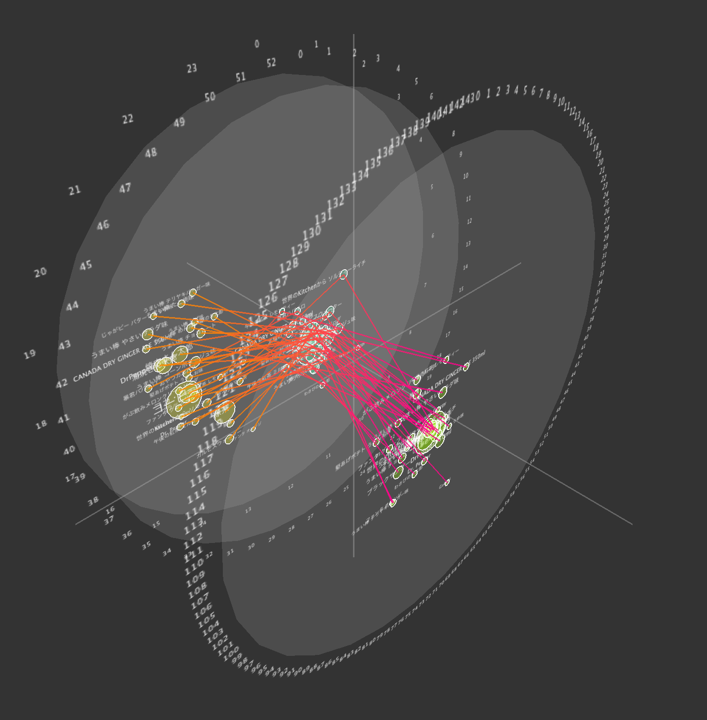
ChronoView is one of the visualization methods for temporal data. It arranges points representing event groups on a circle according to a rule so that it can visualize temporal features of many event groups together.However, the rule is based on a pre-specified display period; therefore, it is not suited to exploring periodic features for unknown periods.The authors extend ChronoView to a 2.5D representation and develop a visualization tool that can analyze temporal data about various periods efficiently.The visual representation has enabled analysts to search for the display periods expressing periodicity of events by displaying several charts of ChronoView in a 3D space and emphasizing the difference in positions of the events due to the difference of the display periods. The tool has functions to assist searching by showing the spectrum and the histogram calculated from the occurrence distribution of events.
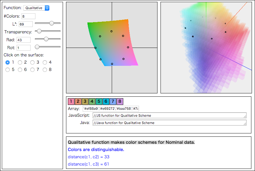
Color plays an important role in information visualization. To use the colors as visual representations of the data effectively, designing color schemes that consider perceptual differences between colors is necessary. We developed a tool to assist in color-scheme design when using the CIE1976L*a*b* (or CIELAB) color space. The CIELAB color space has a property in which the Euclidean distances between any two colors in the space can approximate the perceptual differences between them. However, because the CIELAB color space has a distorted shape, color scheme design in such space is not easy. Our tool allows the designer to see the positions of colors in the CIELAB color space visually to facilitate scheme design. The developed tool provides functions to assist in designing color schemes for nominal, ordinal, and quantitative data.
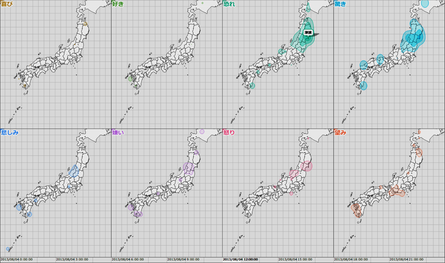
Emotion-weather maps are a type of thematic map used to represent emotions. The maps represent spatial distributions of complex emotions from a large group of people. Most related work focuses on a simple sentiment and draws its distributions on a map. The proposed emotion-weather maps are a set of eight maps, each of which represents one of eight categories of emotions. Emotion data are extracted from social media. The data have some biases in some aspect of time, space, and categories of emotions. Such biases restrict the observation of relatively few emotions. To address this problem, a method to normalize data is proposed.
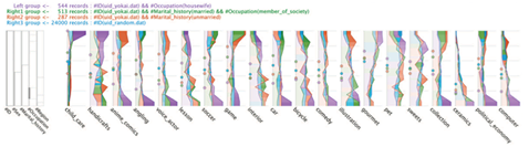
In exploratory analysis of multivariate datasets, performing an analytical task is often necessary. Such tasks may include extracting characteristic subsets and comparing them. Therefore, we support searching and comparing features of multivariate datasets. We developed Blade Graph, which is a visualization technique for comparing distributions by emphasizing coloring according to the size of the difference. In addition, we developed a visual analytical tool with representations for comparing data distributions. In a case study of our analytical tool, we analyzed collective tendencies from a social media dataset.
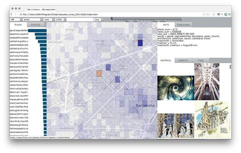
When amateur photographers plan a photo trip, they often decide beforehand on photogenic locations to visit. The aim of the authors is to assist amateur photographers in planning a photo trip. Information and procedures have been organized to help select photogenic locations from the perspective of information design. In addition, an interactive visual tool has been developed to help select photogenic locations. The tool displays information on photogenic locations. The tool allows us to select locations while referring to their geographic relationships. Consequently, the process of selecting photogenic locations becomes easy.
Visualization is an effective way to analyze movement data. Drawing many movement data on a map can cause visual clutter and make difficult to understand several kinds of characteristics, for example, distance, direction, and quantity. To address this problem, we developed a visualization technique, which aggregates movement data according to their directions and distances in each direction. Our visual representation is overlaid on a map, and allows to explore the movement data. (Our visualizations have been adopted on the cover of the conference program of iV2014.)
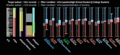
The data comparison is one of the most important tasks in data analysis processes. We developed Parallel Box to support the analysis process of multivariate data by facilitating the flexible comparison of numerous multivariate items. To compare the data distributions of multivariate data, we combined cumulative bar charts and box plots, which are widely used tools in statistics. Using shadow expression based on the visual Gestalt principles of grouping, Parallel Box enables a direct comparison between either datasets or variables. (Received the best paper award at iV2014.)
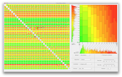
We developed Colored Mosaic Matrix as a method to obtain an overview of high-dimensional data in a limited area of a computer display. Colored Mosaic Matrix is an extension of Mosaic Matrix, it uses colors to represent features of the data. By treating quantitative data as categorical data, it provides a good overview of high-dimensional data with a large number of records.
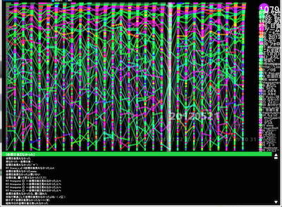
We proposed a technique to visualize changing ranks and values of events along time and developed a trend analysis tool with the technique. The technique represents a rank and a value of an event at a same time by using the width and the vertical position of a rectangle. This allows analysts to grasp trends of both the entire data set and each occurrence.
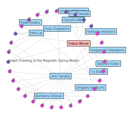
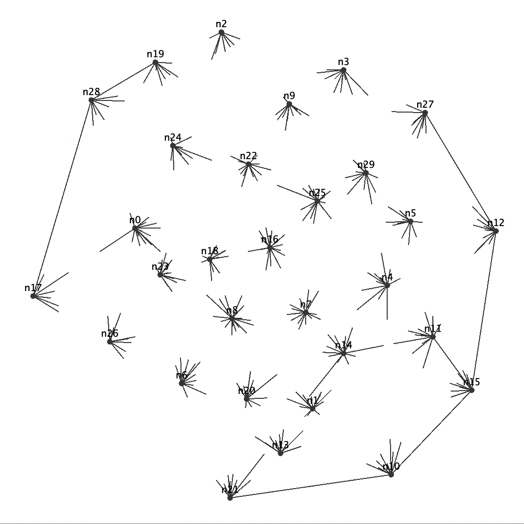
Anchored map is a drawing method of bipartite graphs. We aim to obtain high readability of bipartite networks by using the anchored maps. Suppose that the node set of a bipartite graph is divided into set A and set B. On an anchored map of the bipartite graph, the nodes in A, which are called "anchors," are arranged on the circumference, and the nodes in B, which are called "free nodes," are arranged at suitable positions in relation to the adjacent anchors.
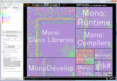
Understanding the activities in large-scale organizations such as big companies is very important. We developed a representation technique to provide a panoramic view of such activities. The representation embeds charts expressing activities into cells of a treemap. By using this representation, both quantitative and temporal aspects of activities can be seen simultaneously. We also developed an analysis tool called ``Series at a Glance,'' which helps in the analysis of tens of thousands of activities by providing useful visual information.
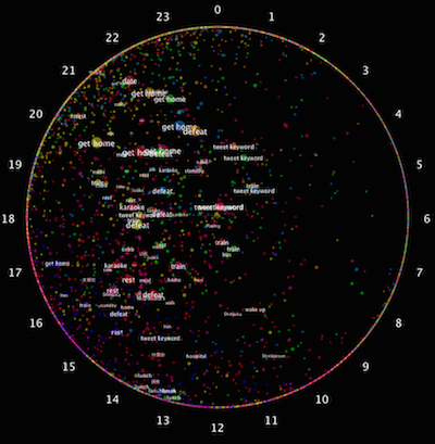
ChronoView is a visualization technique to support the analysis of data with temporal information. ChronoView represents an event with a set of time-stamps as a position inside a circle, similar to the dial of an analog clock. By representing each event as a position on a two-dimensional plane, we can simultaneously visualize many events and easily compare their occurrence patterns.
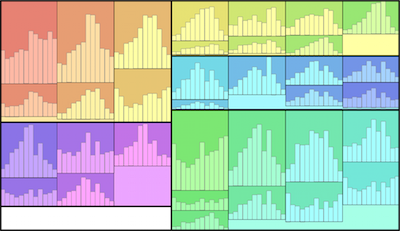
Treemap is a visualization method for hierarchical structures in which nodes are drawn as rectangles and arranged in a nested style. We propose an Edge Equalized Treemap, in which all leaf rectangles have a equal width. This feature works well when we embed other charts into the leaf rectangles. Since widths of leaf rectangles are equal, the scale intervals of the charts can be equalized.