Research Interests
Amoeba
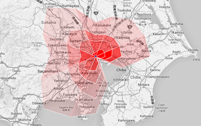
Visualization is an effective way to analyze movement data. Drawing many movement data on a map can cause visual clutter and make difficult to understand several kinds of characteristics, for example, distance, direction, and quantity. To address this problem, we developed a visualization technique, which aggregates movement data according to their directions and distances in each direction. Our visual representation is overlaid on a map, and allows to explore the movement data. (Our visualizations have been adopted on the cover of the conference program of iV2014.)
Parallel Box
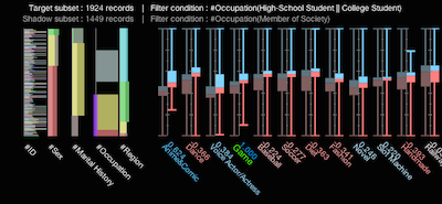
The data comparison is one of the most important tasks in data analysis processes. We developed Parallel Box to support the analysis process of multivariate data by facilitating the flexible comparison of numerous multivariate items. To compare the data distributions of multivariate data, we combined cumulative bar charts and box plots, which are widely used tools in statistics. Using shadow expression based on the visual Gestalt principles of grouping, Parallel Box enables a direct comparison between either datasets or variables. (Received the best paper award at iV2014.)
Colored Mosaic Matrix
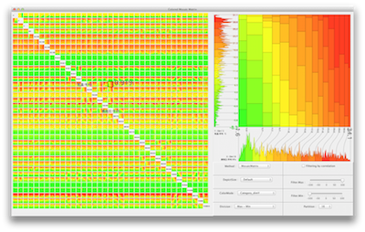
We developed Colored Mosaic Matrix as a method to obtain an overview of high-dimensional data in a limited area of a computer display. Colored Mosaic Matrix is an extension of Mosaic Matrix, it uses colors to represent features of the data. By treating quantitative data as categorical data, it provides a good overview of high-dimensional data with a large number of records.
Visual Trend Analysis Tool
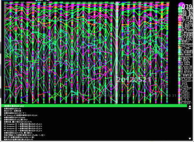
We proposed a technique to visualize changing ranks and values of events along time and developed a trend analysis tool with the technique. The technique represents a rank and a value of an event at a same time by using the width and the vertical position of a rectangle. This allows analysts to grasp trends of both the entire data set and each occurrence.
Anchored Map / Extended Anchored Map
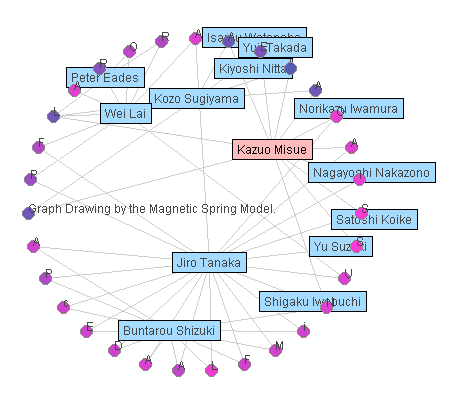
Anchored map is a drawing method of bipartite graphs. We aim to obtain high readability of bipartite networks by using the anchored maps. Suppose that the node set of a bipartite graph is divided into set A and set B. On an anchored map of the bipartite graph, the nodes in A, which are called "anchors," are arranged on the circumference, and the nodes in B, which are called "free nodes," are arranged at suitable positions in relation to the adjacent anchors.
Visualization of Large-scale Activity Data (Series at a Glance)
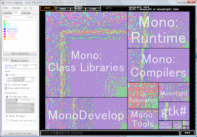
Understanding the activities in large-scale organizations such as big companies is very important. We developed a representation technique to provide a panoramic view of such activities. The representation embeds charts expressing activities into cells of a treemap. By using this representation, both quantitative and temporal aspects of activities can be seen simultaneously. We also developed an analysis tool called ``Series at a Glance,'' which helps in the analysis of tens of thousands of activities by providing useful visual information.
ChronoView: A Visualization Technique of Temporal Information
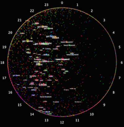
ChronoView is a visualization technique to support the analysis of data with temporal information. ChronoView represents an event with a set of time-stamps as a position inside a circle, similar to the dial of an analog clock. By representing each event as a position on a two-dimensional plane, we can simultaneously visualize many events and easily compare their occurrence patterns.
Edge Equalized Treemap
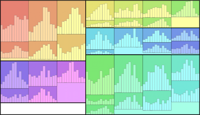
Treemap is a visualization method for hierarchical structures in which nodes are drawn as rectangles and arranged in a nested style. We propose an Edge Equalized Treemap, in which all leaf rectangles have a equal width. This feature works well when we embed other charts into the leaf rectangles. Since widths of leaf rectangles are equal, the scale intervals of the charts can be equalized.